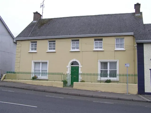
What Colour Actually Loves a Red Brick Wall? Twelve Exterior Schemes That Work With British Brickwork
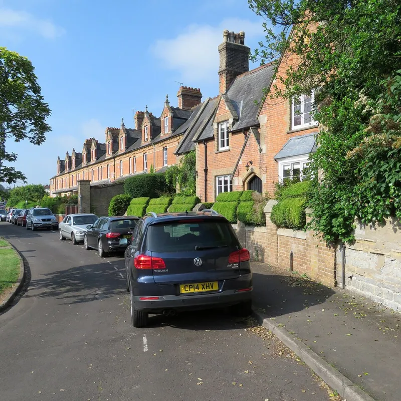
Photo: John Sutton , CC BY-SA 2.0, via Wikimedia Commons
There is a particular kind of heartbreak that comes from watching a lovely old wall of Victorian brick disappear behind three litres of the wrong paint. Not a bad colour, necessarily. Just a colour that argues with the brick instead of working alongside it. The wall goes flat, the street loses a bit of its warmth, and the owner spends the next four summers explaining that it looked different on the card.
Brick is not a neutral backdrop. It is a patterned, textured, slightly grubby material with its own colour temperature and its own opinions. Get the paint right and the whole house pulls together. Get it wrong and you can spend the rest of your ownership noticing it every time you come home.
Start with the brick, not the paint
Before you look at a single colour card, stand across the road and look properly at your wall. British brick is not one thing. A red London stock, an orange Accrington, a pale buff Gault from Cambridgeshire and a yellow stock from Suffolk all behave completely differently next to the same tin of sage green.
The question to ask is not 'what colour do I like?' but 'what does my brick already contain?'. Nearly every brick carries secondary tones — a hint of blue-black in a burnt red, an ochre flush in an orange, a greenish cast in certain pale yellows. Those hidden colours are your shortlist. If you find them, the paint will feel as though it was always there.
Undertones, in plain English
An undertone is the colour you can sense but not quite name. A 'grey' front door with a blue undertone will look cooler and sharper against red brick than a grey with a warm, brownish base, which can go muddy and slightly sad beside strong orange masonry.
The rough rules that hold up most of the time:
- Red and orange brick generally warm to cool, deep colours — blue-blacks, sludgy greens, deep charcoals, oxblood.
- Buff and Gault brick take softer, dustier tones — olive, dove grey, clay pink, pale stone.
- Yellow London stock is the trickiest of the lot. It needs a clean, cool contrast, usually a soft off-white or a deep lead grey, or it will look jaundiced.
- Already-painted brick gives you far more freedom, because the texture has gone and the colour you are working with is flat.
The test patch ritual (do it properly)
Paint a large A3 or bigger patch onto a piece of card, not onto the wall, and tape it up beside the door. Then leave it there for a week. Look at it in the morning, in flat February light, in glaring July sun, and — crucially — in the rain, when the brick goes dark and saturated and every colour on the wall changes character.
If you are choosing between two very similar shades, paint both. You will only tell them apart in situ. And if your house faces north, expect everything to read cooler and greyer than the card suggests; a warm off-white that looks creamy in a paint shop can turn distinctly chilly on a north-facing elevation.
Twelve pairings that hold up on a British street
- Victorian red brick, dark blue-black door, soft off-white sashes. The dependable classic. The dark door reads as a deliberate punctuation mark rather than a shout.
- Red brick, sage green door, cream trim. Gentle, cottage-adjacent, and forgiving of slightly faded brickwork.
- Orange-terracotta brick, charcoal grey trim, pale stone sills. The grey calms the orange without draining it. Excellent on 1930s semis.
- Buff brick, olive green door, stone-coloured frames. Restrained and slightly rural, even in a suburb.
- Yellow London stock, soft white trim, oxblood door. The white does the heavy lifting; the deep red gives it backbone.
- Red brick, shell-pink door, off-white surrounds. Braver than it sounds, especially on a narrow terrace where the door is glimpsed rather than stared at.
- Edwardian red brick with a white-painted bay, deep green door, black railings. The white bay is the traditional move, and it still works.
- Gault brick, lead grey trim, dark oak-stained door. Quiet, expensive-looking, good with stone.
- Red brick, ochre or mustard door, black ironmongery. Warm on warm, but held together by the black details.
- Buff brick, duck-egg blue door, off-white sashes. A coastal-adjacent combination that reads well inland too.
- Red brick, burgundy door, cream stone lintels left unpainted. Match the paint to the quieter tones in the brick rather than competing with it.
- Lane-side cottage in limewash or chalky off-white, black or dark timber door. The whole elevation goes pale and the door does the talking.
Trim, sills and the small stuff
Most of the visual trouble on British houses is not the door — it is the trim. Painting every bit of stonework, sill and lintel a stark brilliant white can make a warm brick wall look shabby by comparison. A softer off-white, a stone colour, or even a mid-tone that picks up the mortar will usually flatter the brick more.
One useful trick: treat the whole window as a single object. Frame, sashes, and surround in one colour reads calm and modern. Painting the sashes one shade and the outer frame another is a traditional look, but it needs confidence and a steady hand.
And do not forget gutters, downpipes and fascias. They are the punctuation at the top of the house, and a shiny black plastic downpipe on a beautifully painted elevation is a small tragedy of its own.
Before anyone mentions the brick itself
If your brick has never been painted, think very hard before you start. Painted masonry needs repainting every few years, and the wrong coating on a soft, old, lime-mortared wall can trap moisture and cause spalling. Breathable masonry paints, mineral paints and limewash exist for exactly this reason and are the sensible route on period homes.
If the wall is already painted, you are working with what you have — sand back anything loose, fill and stabilise, and choose a breathable product.
Character, conservation and the neighbours
In a conservation area, painting previously unpainted brick can need permission, and on a listed building it almost certainly needs listed building consent. Check with your local conservation officer before you buy the sample pot, not after. It is also worth looking up and down the lane: a street of unpainted brick with one sudden white house is a strong look, and not everyone will thank you for it.
The last word is simply this — you are not choosing a colour in isolation, you are choosing how your house sits in a row of houses. The best schemes on any British lane look inevitable. As though nobody ever had to decide.